5734Views 0Comments

Sony Xperia Z3 Design and Overview
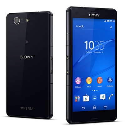
Smartphones of Sony Xperia Z series has always identified with the strict, angular, but very stylish “bricks”. If we talk about the most recent member of the series, then you would find Sony Xperia Z3, which is much lighter than their predecessors, both visually and in fact. The gadget weighs 152 grams, while Z2 with the same screen size – 163 grams. Moreover, the case of the novelty in comparison with the previous version with thickness, the difference comes from 8.3 to 7.3 millimeters.
Changes in appearance are obvious as compare to its predecessors. Corners of the body become more rounded, sides – not as flat, and the frame around the screen – much thinner. Due to the last gadget looks more elongated. It still made of thoroughbred materials – metal (face frame) and glass (rear and front). But now it is much easier to hold in hands – rough edges and flat faces do not dig into the palm. From the viewpoint of ergonomics was significantly better.
Perhaps, Z3 – the most comfortable of all four in the “Z” series, the hands do not get tired of it even after prolonged contact, and thanks to the reduced size it is really quite easy to use with one hand – the thumb, average palm easily reaches to all four sides of the display.
The front panel remains free from the hardware buttons. In its lower part is placed speaker – the same as the top. Next to the last fit the front lens, megapixel cameras and sensors. Indicator of new events moved to the upper left corner.

At the right of Xperia Z3, all connectors are still covered with plugs, through which moisture protection is implemented in housing. Also, there are volume keys and a separate physical button to activate the camera and shoot. At the same end, there are hidden slots for microSD cards and Nano-SIM. Device can handle TF-memory card 64 GB without any flaws. Universal 3.5mm audio-jack imposed on the top end. Next to it is a second microphone, which is implemented by means of noise reduction system.
If we talk about the left portion of the device, there is Micro-USB interface on the left side under the cover removed. With its help, Z3 can connect external peripherals via a special OTG-adapter. Next to it is a magnetic connector, by which the gadget is connected to the docking station.
The back panel of the Xperia Z3 covered by protected glass. There are no stickers in front or rear. Despite the fact that the panel is smooth, due to the rough convex ends Xperia Z3 is excellent in the hands and tries to slip out of them. At the top of the rear of the lens is the main 20-megapixel camera with LED flash.
Housing of smartphone is monolithic, molded – access to the battery users do not have. Its capacity, by the way, by virtue of reducing the thickness of the gadget, the engineers had to cut – from 3200 to 3100 mAh. However, it is perhaps the only unambiguous deterioration in the new flagship smartphone of Sony.
Overall design of Xperia Z3 is pleasant but not revolutionary and we hope Sony engineers would manage to do something bigger with the upcoming models of the series the Sony Xperia Z4 and Sony Xperia Z5.


