eCommerce Sites and Usability
Having a good website design is the bread and butter of e-commerce businesses in the digital age. It’s not just about what looks great – it’s also about the usability of the website. This can impact on a number of things, including the time users spend on-site, which can then affect your SEO rankings. Here are some of the main things you should consider with web design that will improve user experience.
Responsive Design

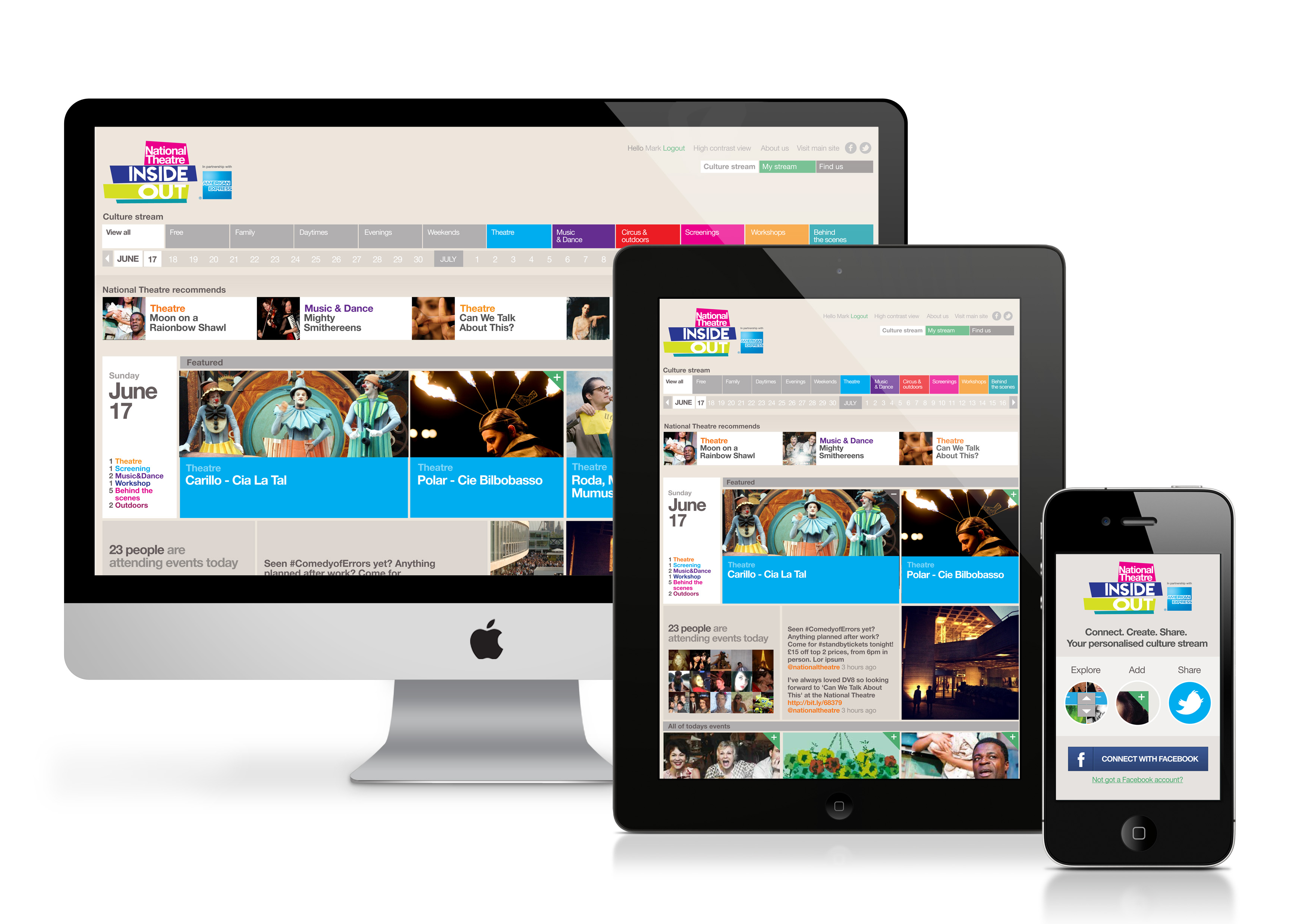
With more people using mobile devices to access the internet, the need for websites to display content in a way that is adaptable is vital. It should be top of the list of your requirements when you look to overhaul the design of your site. Consider different sizes of screens and tablets – not just mobile phones.
Clear Calls to Action
A vital thing to consider is what you actually want users to do once they arrive on your website. Most web users have a destination in mind, and once they’re using your site it is the design that should guide them on what comes next. Make sure that you have clear menus and shortcuts where necessary to direct traffic to the most useful place depending on what your audience’s goals are.
Your navigation also falls under this category. Having too many sub-levels on menus can look cluttered and become frustrating for users, so keep them as clean as your industry allows, and consider menu placement on specific pages.
Typography
Thanks to Google web fonts, it’s now easier than ever to access fonts that are compatible with a visually appealing design. A lot of agencies also have in-house catalogues, so it’s worth checking with your web design company for guidance on what might work best for your project. This is where you can also consider how typography might affect accessibility for those with disabilities: for example, some script fonts can be much more difficult for a visually impaired person to understand.
Avoid Click-Bait
Shooting for long-form content is ultimately a better way to keep people on your site for longer. Having to click through several pages to get to the information they want is likely to result in higher bounce rates, as the user becomes more frustrated at not being able to find what they’re looking for. Avoiding click-bait is also good practice: enticing people to click a certain link has a time and place, and if people are on your website, then you already know they are in the right place.
Provide Feedback
Utilising plug-ins that display live customer feedback or having a page for testimonials can be a great way to keep users on-site rather than clicking away to find feedback elsewhere. Seeing what other people are saying is a great way to back up a call to action by reassuring users that people have already had a positive experience.
There are many aspects of web design to consider, each with a different impact on user experience. The most important things to consider, however, are responsive design, typography, and navigation. Paying attention to these areas will provide you with a strong framework from which to build a website that truly enriches the user experience.


