8 Vital Elements To An Absolute Logo Design
Does your brand or company have a logo design which is more than just a logo and is a complete explanation about your services? Logo is the smallest but the most imperative part of your brand, your company or brand uses the logo for years so it has to be fresh, energetic and appeals the customer every time they look at it. Use the latest fonts, trendy icons, soft and eye catching colors. Your logo is your identity; it reflects what you are and how you intend to work for your clients.

Web designs only allow an inadequate number of font choice, this is because the consistency of fonts on web design makes website content more readable. But, there are no restrictions of fonts for any printed form of marketing materials, the more elements you use in these the more interest people take in reading them.
Let us now see what are the vital elements that make logo a comprehensive brand identity;
- Logo design or logotype. Logo can be a graphic symbol either black and white or colored, it depends on the user’s choice, whereas a logotype is only a text based representation of your product’s or company’s name, for example Google and Oracle. Both of these styles should be designed professionally and their own domains.
- Logo variations. You logo should be rendered again and again, you’ll need reworking based on usage and placement of logo, they all should have the same vital qualities.
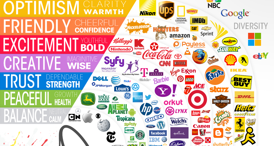
- Elegant colors. Corporate and elegant colors should be used in the logo, web design and other marketing materials will use these colors. Mostly there are one or two colors used in the logo design, but some may vary depending upon the complexity of the logo. Logo Design Company prefers multi and single color logos for their perspective clients.
- Add more colors (where appropriate). Add more colors to your logo design if you think it will give your logo a unique style and will make it more attractive. Use contrast or pastel colors. Don’t hesitant to apply additional colors if you think your color choice would give your logo a edge among others then go for it, make it appealing and exceptional.
- Corporate Fonts (trendy and explicable). Make use of the latest fonts which are famous and are up to date, don’t go for the out dated fonts which will only worsen your logo design.
- Typographic Showcase. Use typographic styling in your logo (if necessary), make use of some capital letters with small letters, like how you write headings to get user’s attention. Keep in mind that not all fonts look good this way, it will depend on you that how creative you are. Some logo design companies have expert level of logo designers who play around the logo so well that the output fascinates the viewers.
- Consistent Images. You are not bound to use the same images again and again, but whatever you use should have consistency for all marketing and web design materials. Rather you don’t have to use the images for the logo design, you can use illustrations, line art or just graphs and charts, but whatever you select for your logo design; it should remain consistent for every medium.
- Useable Content. Always have a complete Library of graphics elements; it saves the time for searching the elements. Graphics elements often come handy when you opt to start a logo design; they give inspiration and can be used in illustration form in the design. Self starters make their life tough when they go over web and start searching for the inspirational elements for their logo designs.

When you an absolute graphic identity, it creates a base for a solid logo design or brand identity. Logo design companies are giving new trends of logo designing, be it icon based or typographic, logo designs have new trends these days.
About Author
Nauman Akhtar is a professional Content Writer, Web Designer, Logo Designer, Front-End and WordPress developer. He owns a Web Design Company providing outstanding design, development and SEO services.


